
Overview
Siren is a safety-first dating app prototype designed to prioritize user safety and foster confident
connections.
Inspired by social media slang about "red flags" in dating, the idea was pitched by team leader Jasmine To in August 2023.
Developed for our Interactive Design II class, we spent four weeks using the Lean UX Design method to craft a functional prototype.
Team
Jasmine To (lead)
Wineury Almonte
Anderson Fisher
Bibilomo Sanni
Timya Harden
Roles
User Interface Design
User Interviews
Prototyping
Tools
Figma
Miro
Discord
Teams
Google Slides
Timeline
4 Weeks
Sept 2023 - Nov 2023
Lean UX Methodology
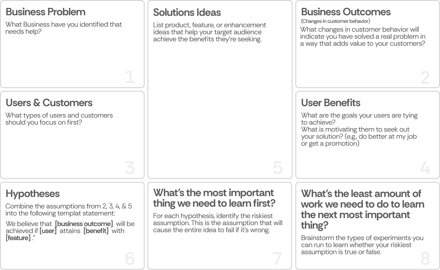
We used Jeff Gothelf's Lean UX method to guide our approach, focusing on running experiments to evaluate user assumptions.
The method involves an eight-box canvas, where we documented our initial answers and solutions for each prompt.
Lean UX is ideal for dynamic environments, making it well-suited for university projects.
The assumption is that users seek safety and meaningful connections, with success defined by consistent use and a focus on quality over quantity in matches.

Prototype Persona: Meet Aubrey
Aubrey is 25, single, and inexperienced in the dating scene. She’s busy but eager to form meaningful connections—with safety as her top priority. We created Aubrey based on our initial assumptions of who might benefit most from our product, acknowledging that his profile will evolve as we gather real user data.
Obstacles: Skepticism toward strangers, uncertainty about mutual intentions, risk of catfishing, and fear of online harassment.
Needs: Help finding authentic connections, sense of safety, and control over her dating pool.
Prioritizing hypotheses with Lean UX
We kicked things off by ranking our hypotheses based on risk and value, laser-focusing on those that were high-risk and high-value.
Guided by the principle of “least amount of work to learn the most important thing,” we built quick, low-fidelity MVPs to test our biggest assumptions about user behavior.
Our experiments centered on two key features:
A report call-outs system and required video calls
With our hypotheses prioritized, we structured the work into two focused sprints to test, validate, and refine key features.
Start of Sprint 1
What’s our focus for this sprint?
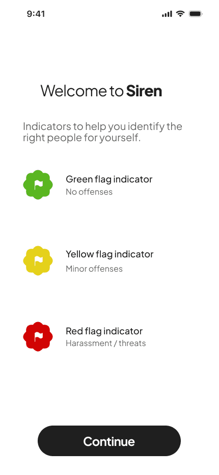
In Sprint 1, our focus was to determine how users interpret and react to behavior flags on profiles.
We wanted to understand whether report callouts (visible indicators of how many times a user has been flagged) would make users feel safer—or if they would be too intrusive.
This sprint was conducted during the course of 2 weeks.
Week 1-2: Assessing Report Callouts
Key activities include...
Create low-fidelity profiles in Figma
Conduct user testing with campus participants
Observe and test user behavior on profile evaluation
Craft an onboarding setup on account creation
Solutions - Low fidelity
Our team defined a solution to address the business problem while meeting our proto-persona’s needs.
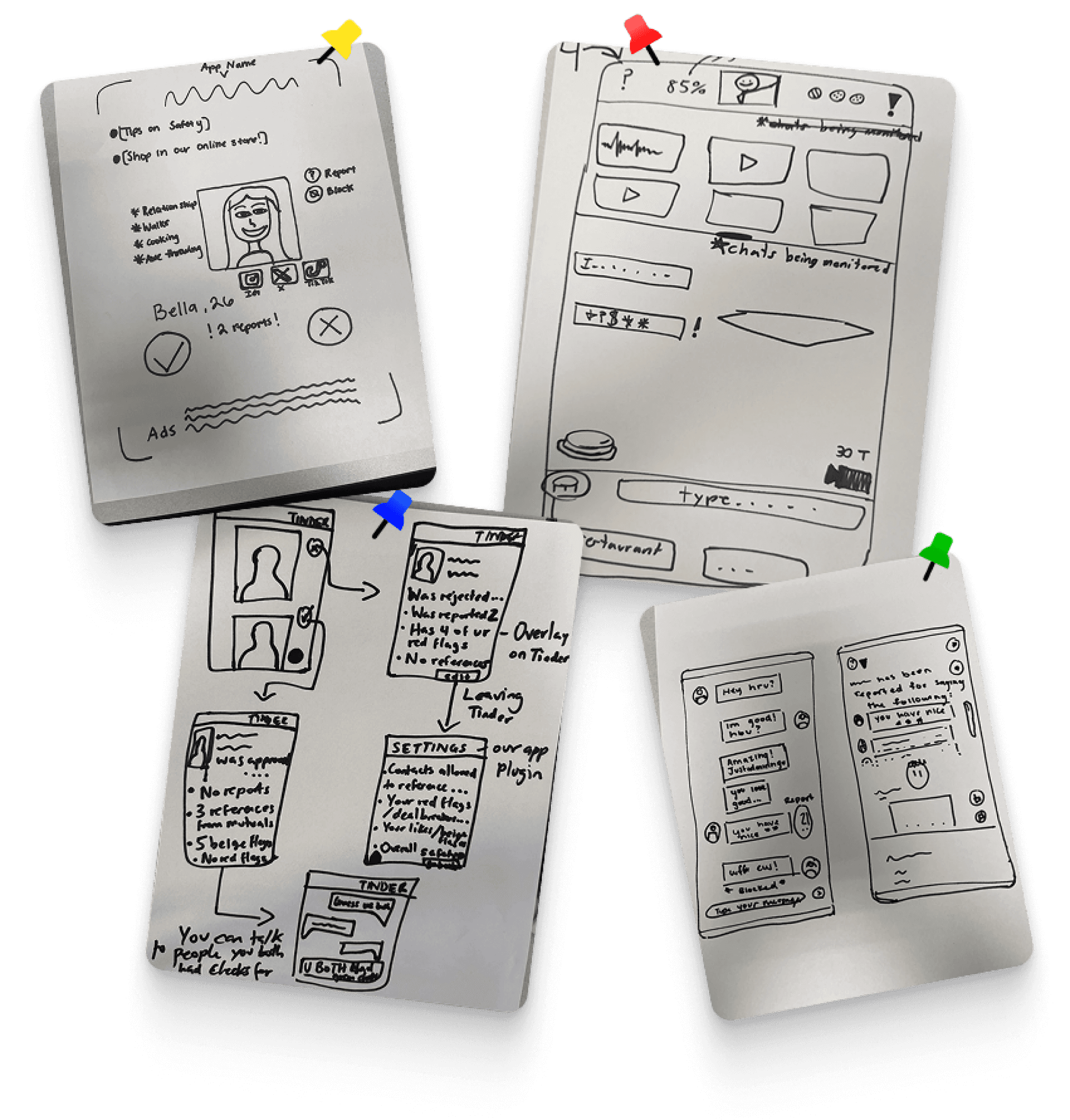
We started by sketching possible interfaces to tackle our problem space, aiming to align on a single idea or merge multiple concepts.
Based on team input, we decided to combine 4 popular ideas into one cohesive solution.
Draft - Red Flag

Draft - Yellow Flag
Draft 2 - Yellow Flag
Swipe
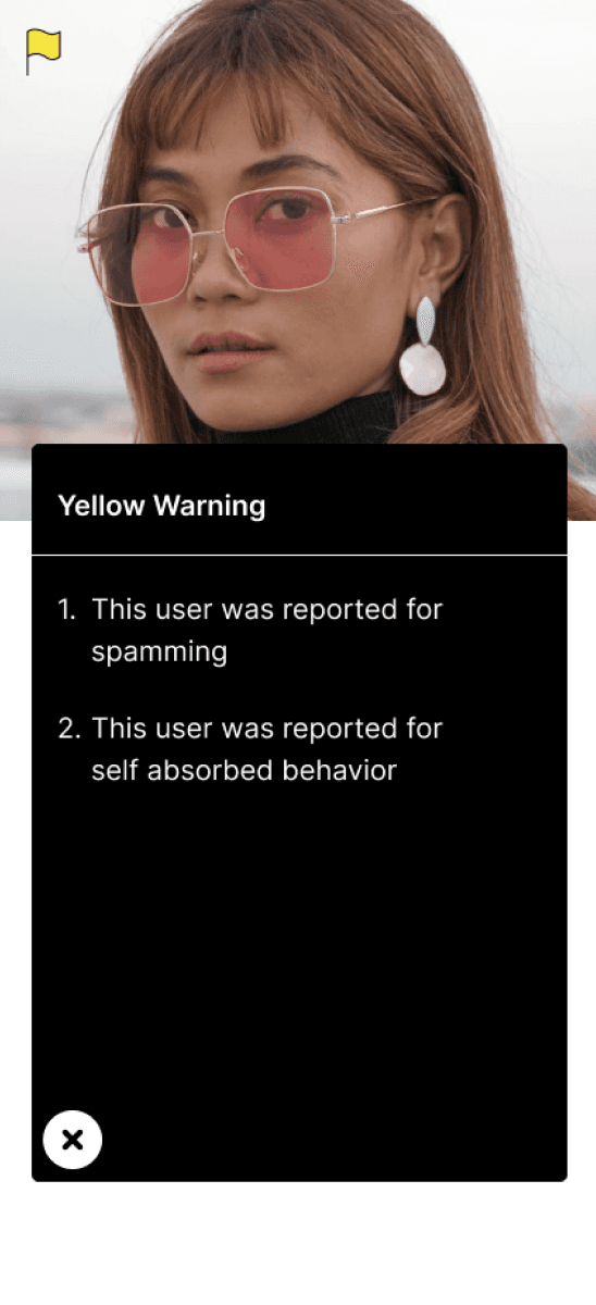
Testing: Warning Callouts
After identifying key pros and cons from our Week 2 experimentation, we used these insights to refine our design.
We developed medium-fidelity prototypes to test how behavior flags should appear within user profiles, ensuring they felt informative yet unobtrusive.
With these prototypes, we conduced user interviews.
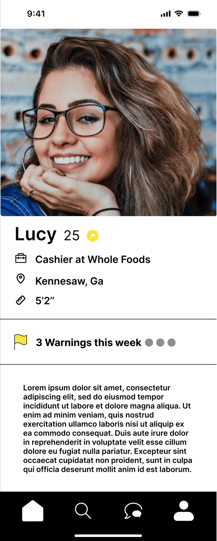
Advantages
Green/yellow/red flags made users feel safer
Green flags provided clarity
Users were open to dating people with yellow flags
Disadvantages
Confusion about how flag colors were determined
Some believed red-flagged users should be banned entirely
Swipe
Landing

Onboarding - 1

Onboarding - 2
Onboarding - 3

Onboarding - 4
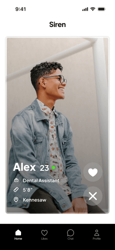
Green Flag Profile - Toggled

Green Flag Profile - More

Final Design: Onboarding & Report Toggle
We crafted a concise, multi-step onboarding flow that introduces Siren’s core safety features.
Users preferred discretion – Reports should be hidden rather than displayed prominently. (Siren Toggle)
Flags were useful, but placement mattered – Reports felt overwhelming when they were too visible outside of a profile.
Users took yellow/red flags into account but didn't always avoid them – Some were still open to matching depending on context.
*Redesign in progress
Start of Sprint 2
What’s our focus for this sprint?
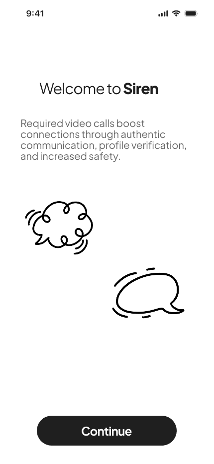
In Sprint 2, our focus was to validate whether a required video call after a set number of text exchanges would improve trust and reduce catfishing.
While video verification could enhance safety, we needed to determine if users would accept it or feel forced into an uncomfortable experience.
The main questions:
Would users accept the requirement or feel forced into an uncomfortable experience?
Would they recognize and react to deceptive behavior during a video call?
How naturally could this feature fit into the dating experience?
Week 3: Assessing Required Video Calls
Key activities include...
Simulated text and video interactions
Observed user responses after the call
Final usability testing with the high-fidelity prototype
Catfish photos used


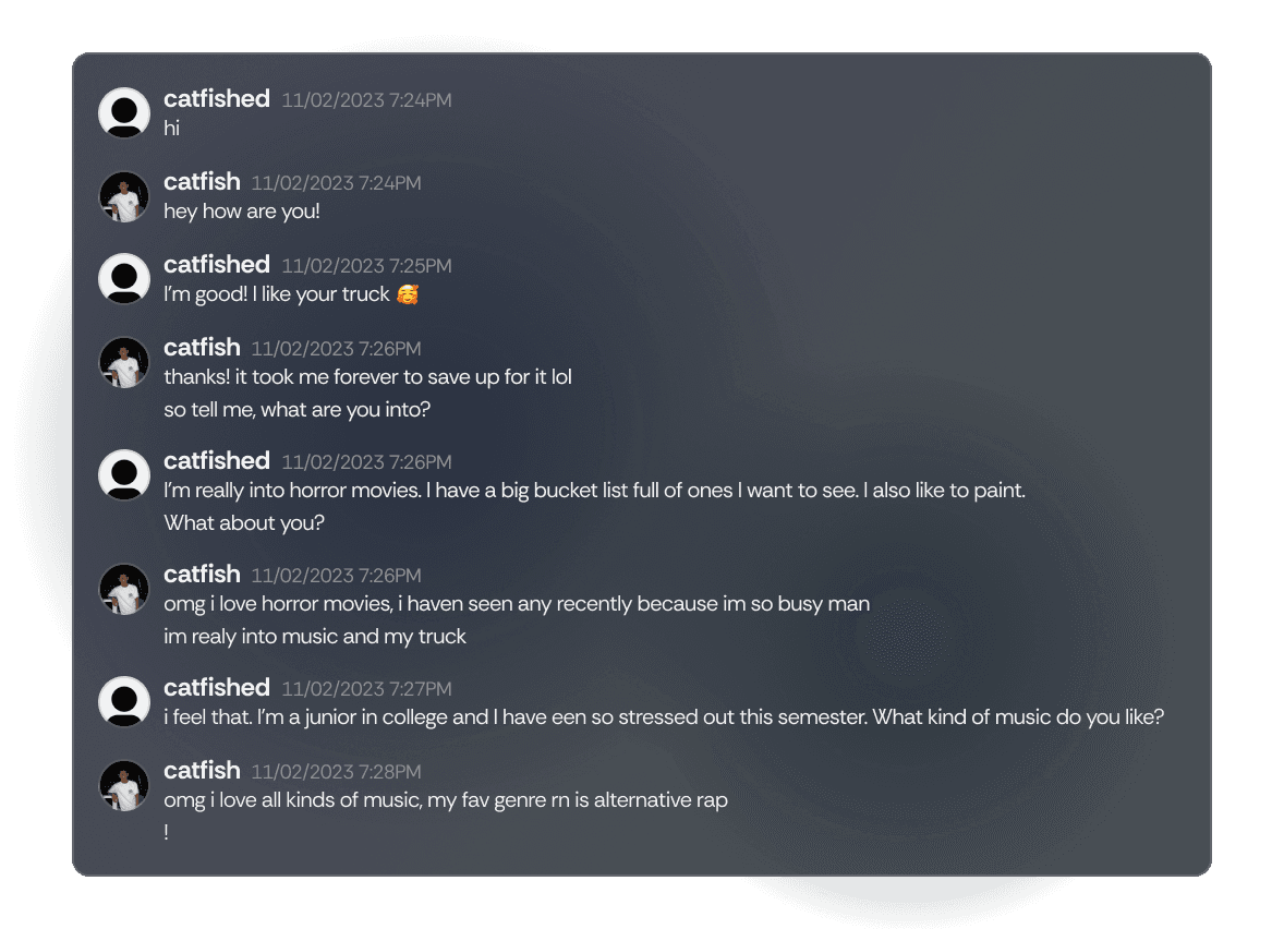
Catfish Experiment Messages * via Discord
Swipe
Main Insights
Users noticed catfish behavior during the video call – The feature successfully helped participants identify deceptive users.
Increased trust in matches – Video verification gave users more confidence before deciding to meet in person.
Preferred as a safety net – While some users didn’t like being required to call, most saw it as a valuable security measure rather than an inconvenience.
Matched * (Old)
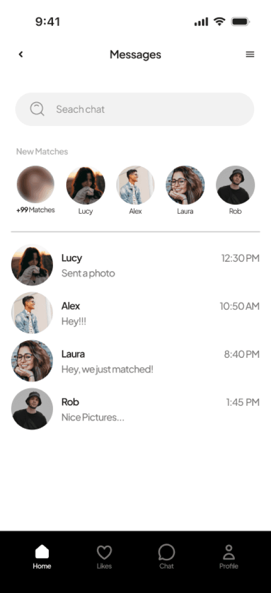
Candidate Selection
Messages

Swipe
Final Iterations
Chat - Video Call Alert

Chat - Video Call Locked
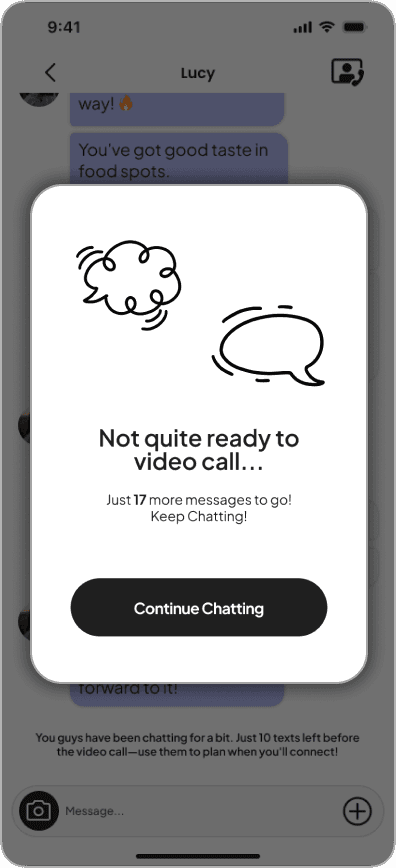
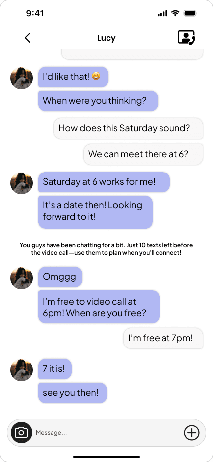
Chat - Time Schedule
Swipe
Week 4: Unlocking Calls
Prevent users from calling too early – Calls can only be initiated after reaching the required text limit.
Introduce a notification system – Users are warned when they’re nearing the message cap, helping them prepare for the required video call.
Enable text-based scheduling – Instead of an automated system prompt, users can coordinate calls naturally through chat.
Retrospective
Throughout both sprints, our Lean UX approach allowed us to quickly test assumptions, gather feedback, and refine our designs based on real user insights. One of the biggest successes was how users responded to the flagging system—they felt safer knowing there was a way to gauge behavior at a glance.
The required video call also proved effective in reducing catfishing concerns, as users reported feeling more confident about their matches. These features reinforced trust and transparency, two key pillars of our design.
However...
Some were confused about how flag colors were determined, indicating a need for clearer communication around the reporting process and what even is a “red flag”.
Addressing these concerns in our high-fidelity prototype helped create a more intuitive and user-friendly experience, balancing safety with user autonomy.
Copyright © 2025 Wineury Almonte. All rights reserved.
Overview
Siren is a safety-first dating app prototype designed to prioritize user safety and foster confident
connections.
Inspired by social media slang about "red flags" in dating, the idea was pitched by team leader Jasmine To in August 2023.
Developed for our Interactive Design II class, we spent four weeks using the Lean UX Design method to craft a functional prototype.
Team
Jasmine To (lead)
Wineury Almonte
Anderson Fisher
Bibilomo Sanni
Timya Harden
Roles
User Interface Design
User Interviews
Prototyping
Tools
Figma
Miro
Discord
Teams
Google Slides
Timeline
4 Weeks
Sept 2023 - Nov 2023
Lean UX Methodology
We used Jeff Gothelf's Lean UX method to guide our approach, focusing on running experiments to evaluate user assumptions.
The method involves an eight-box canvas, where we documented our initial answers and solutions for each prompt.
Lean UX is ideal for dynamic environments, making it well-suited for university projects.
The assumption is that users seek safety and meaningful connections, with success defined by consistent use and a focus on quality over quantity in matches.
Prototype Persona: Meet Aubrey
Aubrey is 25, single, and inexperienced in the dating scene. She’s busy but eager to form meaningful connections—with safety as her top priority. We created Aubrey based on our initial assumptions of who might benefit most from our product, acknowledging that his profile will evolve as we gather real user data.
Obstacles: Skepticism toward strangers, uncertainty about mutual intentions, risk of catfishing, and fear of online harassment.
Needs: Help finding authentic connections, sense of safety, and control over her dating pool.
Prioritizing hypotheses with Lean UX
We kicked things off by ranking our hypotheses based on risk and value, laser-focusing on those that were high-risk and high-value.
Guided by the principle of “least amount of work to learn the most important thing,” we built quick, low-fidelity MVPs to test our biggest assumptions about user behavior.
Our experiments centered on two key features:
A report call-outs system and required video calls
With our hypotheses prioritized, we structured the work into two focused sprints to test, validate, and refine key features.
Start of Sprint 1
What’s our focus for this sprint?
In Sprint 1, our focus was to determine how users interpret and react to behavior flags on profiles.
We wanted to understand whether report callouts (visible indicators of how many times a user has been flagged) would make users feel safer—or if they would be too intrusive.
This sprint was conducted during the course of 2 weeks.
Week 1-2: Assessing Report Callouts
Key activities include...
Create low-fidelity profiles in Figma
Conduct user testing with campus participants
Observe and test user behavior on profile evaluation
Craft an onboarding setup on account creation

Solutions - Low fidelity
Our team defined a solution to address the business problem while meeting our proto-persona’s needs.
We started by sketching possible interfaces to tackle our problem space, aiming to align on a single idea or merge multiple concepts.
Based on team input, we decided to combine 4 popular ideas into one cohesive solution.
Testing: Warning Callouts
After identifying key pros and cons from our Week 2 experimentation, we used these insights to refine our design.
We developed medium-fidelity prototypes to test how behavior flags should appear within user profiles, ensuring they felt informative yet unobtrusive.
With these prototypes, we conduced user interviews.
Advantages
Green/yellow/red flags made users feel safer
Green flags provided clarity
Users were open to dating people with yellow flags
Disadvantages
Confusion about how flag colors were determined
Some believed red-flagged users should be banned entirely
Landing
Onboarding - 1
Onboarding - 2
Onboarding - 3
Onboarding - 4
Green Flag Profile - Toggled
Green Flag Profile - More
Swipe
Final Design: Onboarding & Report Toggle
We crafted a concise, multi-step onboarding flow that introduces Siren’s core safety features.
Users preferred discretion – Reports should be hidden rather than displayed prominently. (Siren Toggle)
Flags were useful, but placement mattered – Reports felt overwhelming when they were too visible outside of a profile.
Users took yellow/red flags into account but didn't always avoid them – Some were still open to matching depending on context.
*Redesign in progress
Start of Sprint 2
What’s our focus for this sprint?
In Sprint 2, our focus was to validate whether a required video call after a set number of text exchanges would improve trust and reduce catfishing.
While video verification could enhance safety, we needed to determine if users would accept it or feel forced into an uncomfortable experience.
The main questions:
Would users accept the requirement or feel forced into an uncomfortable experience?
Would they recognize and react to deceptive behavior during a video call?
How naturally could this feature fit into the dating experience?
Week 3: Assessing Required Video Calls
Key activities include...
Simulated text and video interactions
Observed user responses after the call
Final usability testing with the high-fidelity prototype
Catfish photos used
Catfish Experiment Messages * via Discord
Swipe
Main Insights
Users noticed catfish behavior during the video call – The feature successfully helped participants identify deceptive users.
Increased trust in matches – Video verification gave users more confidence before deciding to meet in person.
Preferred as a safety net – While some users didn’t like being required to call, most saw it as a valuable security measure rather than an inconvenience.
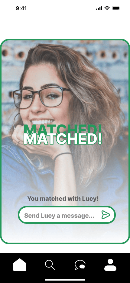
Matched * (Old)
Candidate Selection
Messages
Swipe
Final Iterations
Chat - Call Alert
Chat - Call Locked
Chat - Schedule
Swipe
Week 4: Unlocking Calls
Prevent users from calling too early – Calls can only be initiated after reaching the required text limit.
Introduce a notification system – Users are warned when they’re nearing the message cap, helping them prepare for the required video call.
Enable text-based scheduling – Instead of an automated system prompt, users can coordinate calls naturally through chat.
Retrospective
Throughout both sprints, our Lean UX approach allowed us to quickly test assumptions, gather feedback, and refine our designs based on real user insights. One of the biggest successes was how users responded to the flagging system—they felt safer knowing there was a way to gauge behavior at a glance.
The required video call also proved effective in reducing catfishing concerns, as users reported feeling more confident about their matches. These features reinforced trust and transparency, two key pillars of our design.
However...
Some were confused about how flag colors were determined, indicating a need for clearer communication around the reporting process and what even is a “red flag”.
Addressing these concerns in our high-fidelity prototype helped create a more intuitive and user-friendly experience, balancing safety with user autonomy.
Draft - Red Flag
Draft - Yellow Flag
Draft 2 - Yellow Flag
Swipe
Copyright © 2025 Wineury Almonte.
All rights reserved.